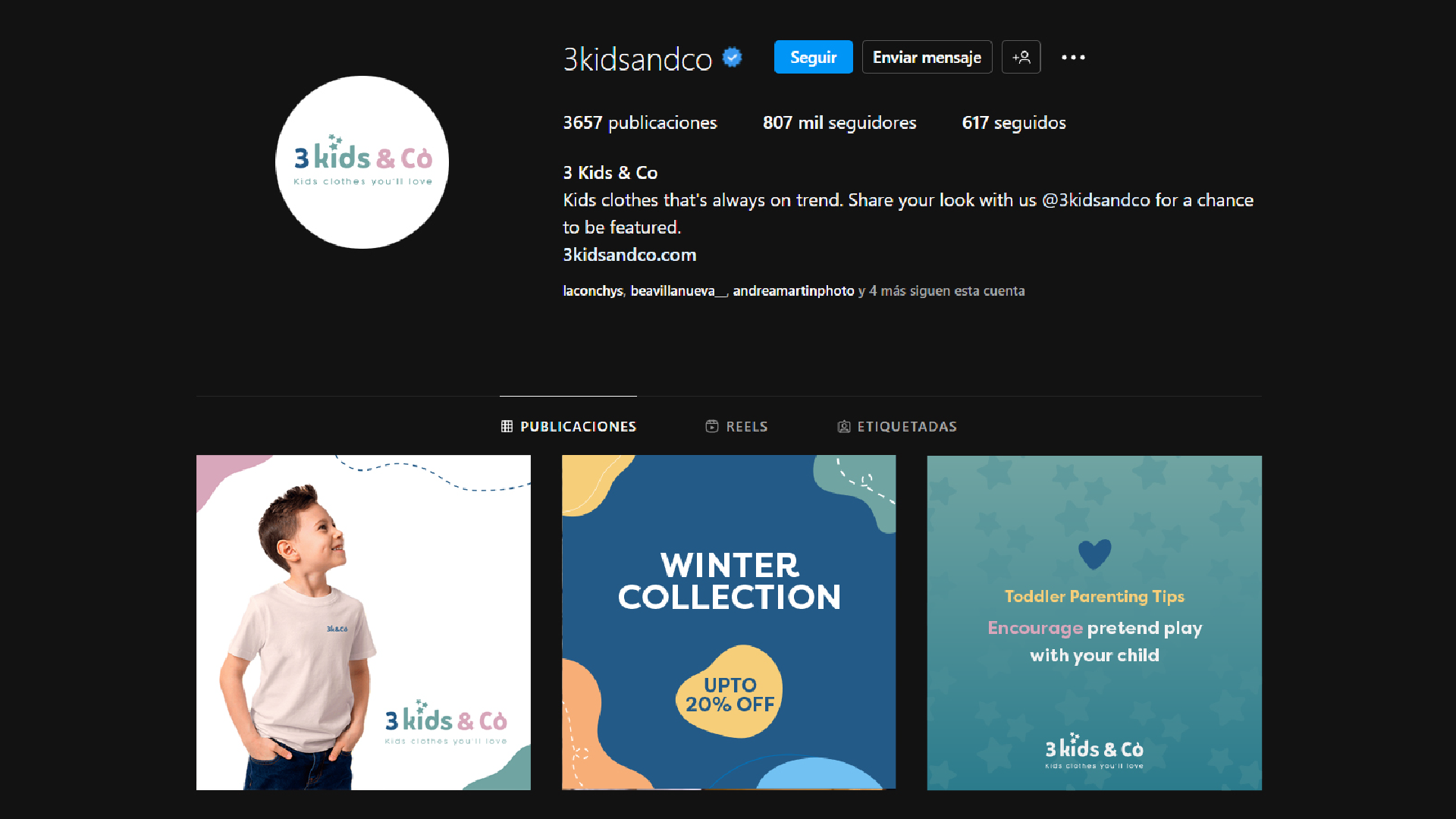
Introducing the branding design for '3 Kids and Co'
Welcome to the world of '3 Kids and Co.' Our logo design journey is a celebration of childhood, family, and thoughtful design. Explore how each element in our logo, from stars to colors, weaves a unique narrative that captures the essence of our brand. Join us on this visual adventure where creativity meets heartwarming inspiration.
Concept
Through a journey into the realm of semiotic analysis, we delve into the intricate elements harmoniously woven together in the '3 Kids and Co' logo, a testament to thoughtful design.
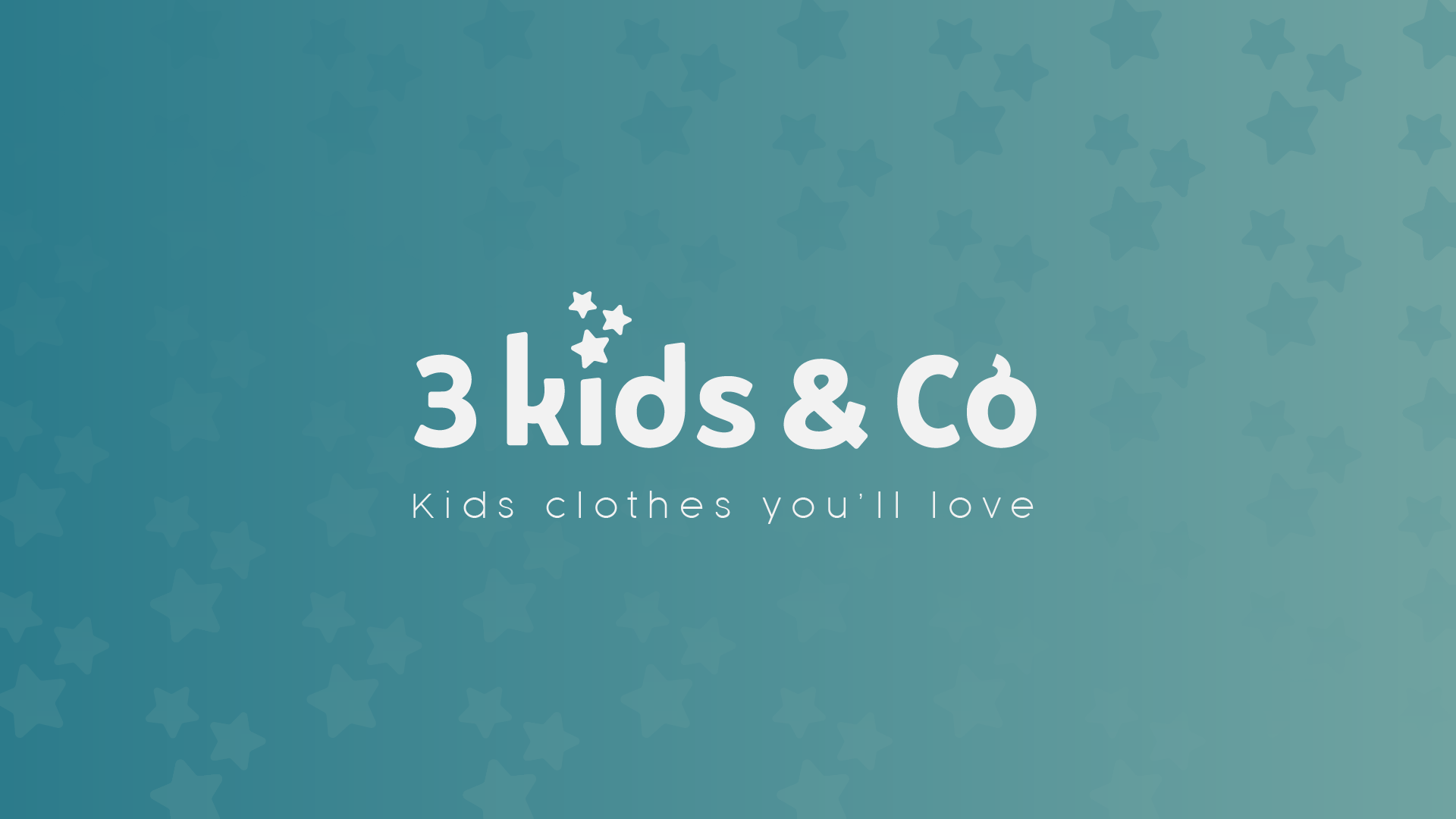
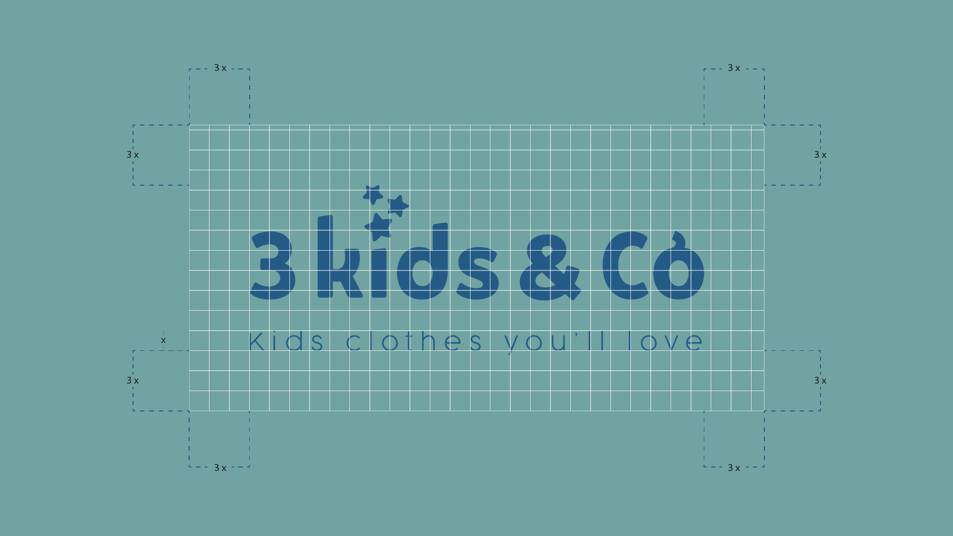
At the heart of this logo lies the '3 Kids and Co' text, where each letter and element carries a unique narrative. The 'i' in 'Kids' boasts three radiant stars, a heartfelt homage to the trio of children who inspired this design.
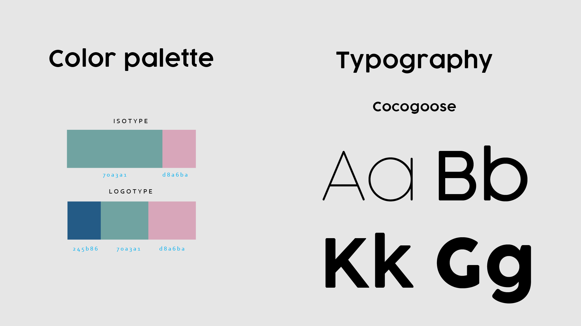
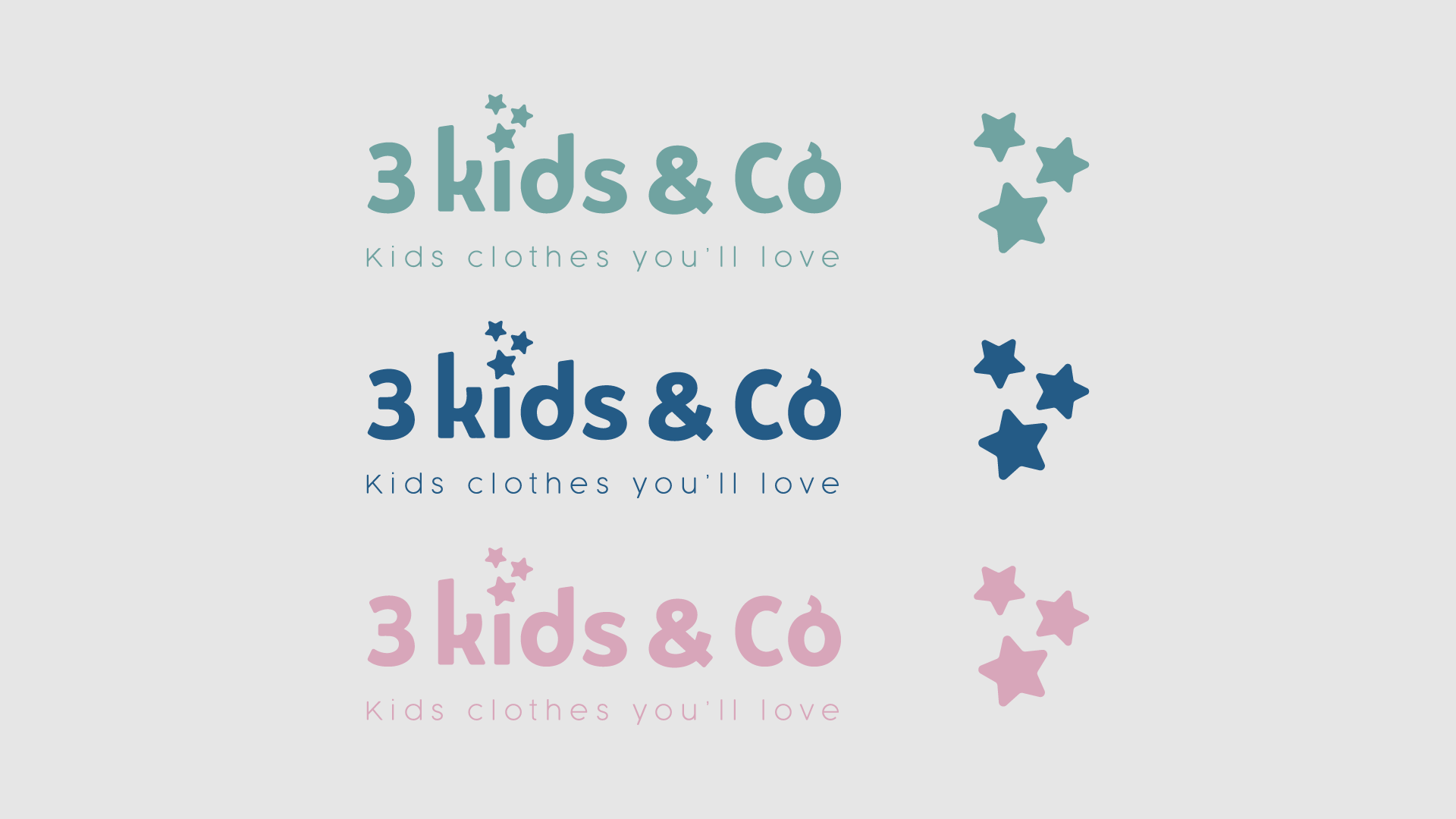
Imagine a color palette where 'Seaside Blue,' reminiscent of serene childhood moments, mingles with 'Aquatic Mint,' reflecting the exuberance of kids at play. 'Blushing Peach' adds a touch of warmth and affection to the composition.
Our chosen typeface, Cocogoose, epitomizes sophistication and modernity, infusing the design with a sense of quality and style.
In essence, '3 Kids and Co' celebrates the enchantment of childhood and the love of family. This logo isn't just a design; it's a carefully crafted story.
