Introducing the branding design for 'DC4'
Welcome to the unveiling of the branding project for 'DC4' - Deportes Canal 4, a sports channel that embodies the fusion of dynamism, teamwork, and unwavering sportsmanship.
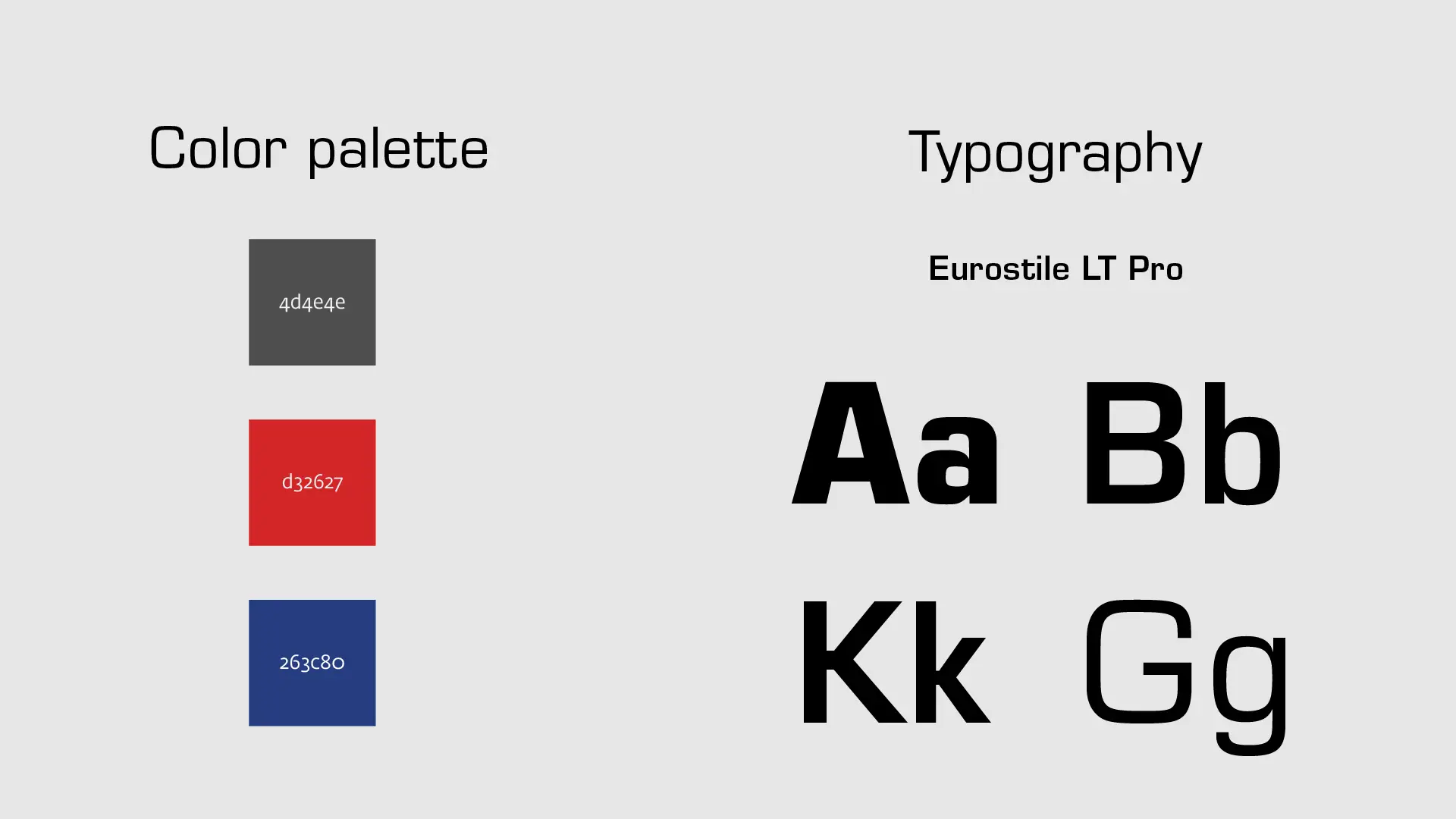
In this presentation, we delve into the heart of the DC4 brand identity, exploring the intricacies of its logo design, conceptual underpinnings, visual mockups, captivating color palette, and deliberate typographic choices.
By applying the art of semiotic analysis, we've crafted a brand that mirrors the essence of sports itself, capturing its energetic spirit while maintaining an unwavering commitment to excellence.
Concept
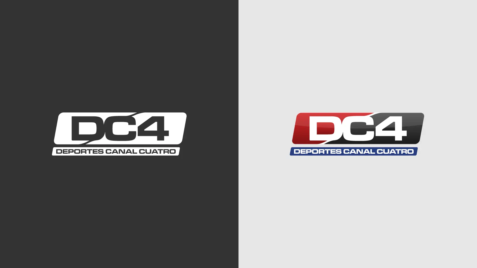
By conducting a semiotic analysis, we can uncover the amalgamation of elements that come together to convey the essence of the logo for DC4, which stands for Deportes Canal 4.
The inclined orientation of the logo immediately suggests speed and agility, drawing strong parallels to action-packed sports. The rounded edges bring an element of flexibility, symbolizing the adaptability required in the world of sports.
The defining feature, a curved line dissecting the logo into two parts, signifies the customary division found in sports, typically represented by opposing teams. Its curved nature not only adds a dynamic touch but also evokes a sense of movement, mirroring the fluidity of athletic endeavors.
Contrastingly, the typography is squared off, exuding a sense of solidity and toughness, which resonates with the robust nature of sports.
In summary, the DC4 logo encapsulates the core principles of agility, adaptability, rivalry, and strength, making it a fitting emblem for a sports channel in the network.
