Introducing the branding design for 'Măgica Studios'
Welcome to the world of 'Măgica Studios' This logo design journey is a celebration of magic and sobriety. Explore how each element in this logo. Join me on this visual adventure where creativity meets heartwarming inspiration.
Concept
Exploring the realm of semiotic analysis allows us to unravel the fundamental components that come together in our design to convey the logo's inherent message.
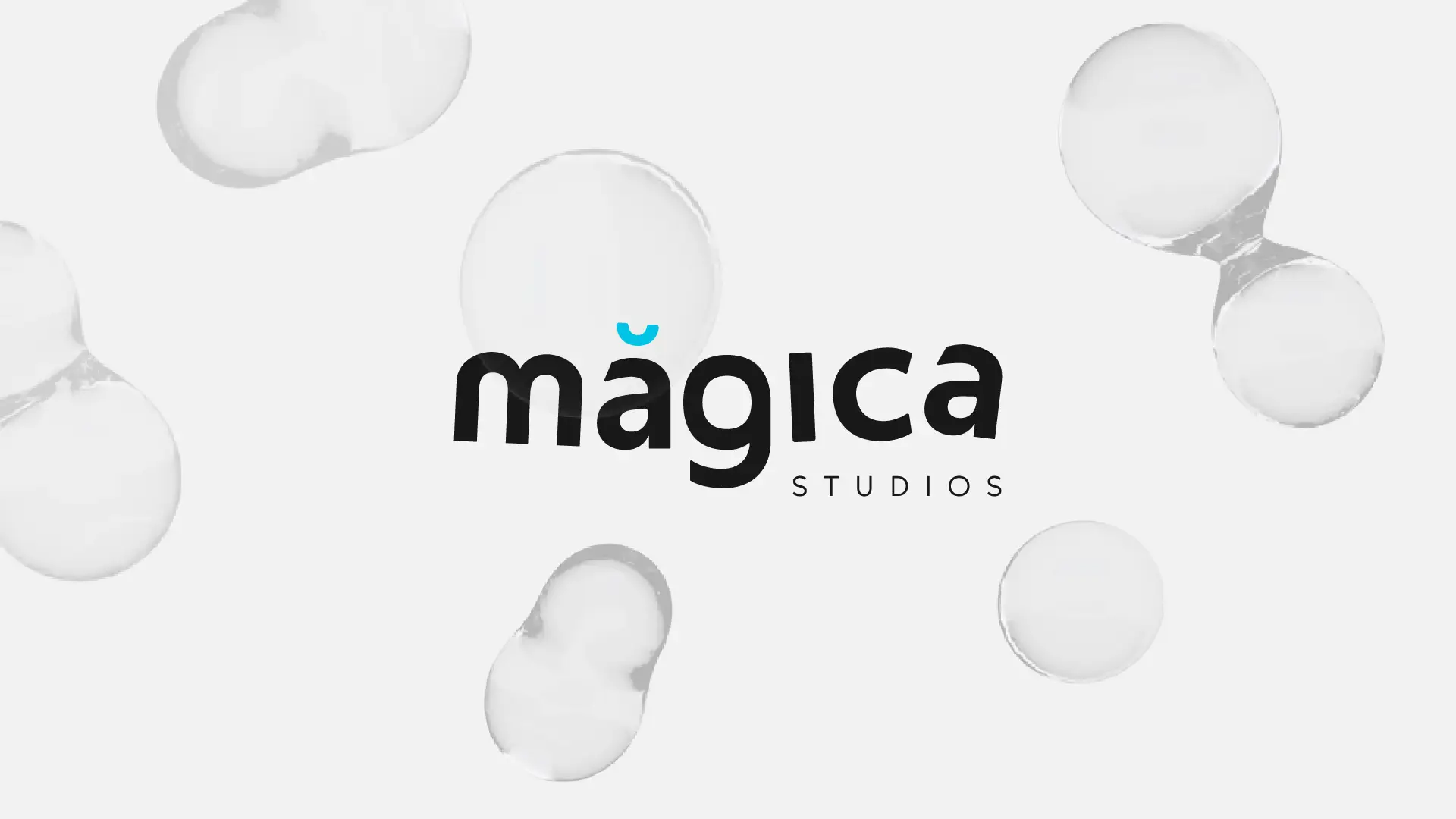
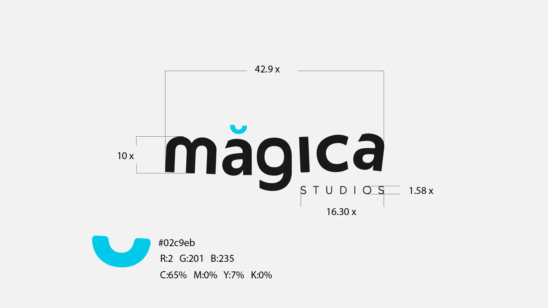
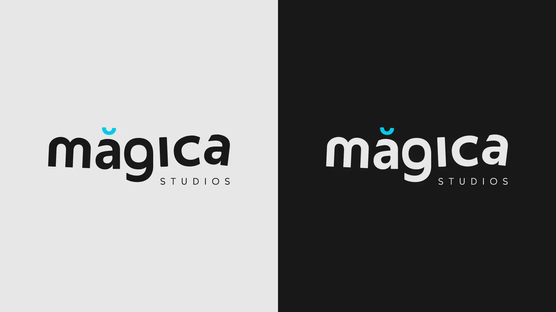
The typography is a dance of contrasts. 'Magica,' in lowercase, exudes an aura of fantasy and charm. Its slightly skewed alignment alludes to a playful sense of movement, reminiscent of the animation world, while also evoking a sensation of levitation akin to a magician's trick.
Below, 'STUDIOS' appears in uppercase, firmly anchored but artistically smaller, providing a stable foundation for the magic above.
In this blend of visual storytelling, we discover the essence of Magica Studios, where imagination knows no bounds, and each frame tells a story.
