Welcome to the branding journey of 'Malacate'
A distinctive barbershop tailored exclusively for gentlemen. In this portfolio, we delve into the essence of Malacate's brand identity, focusing on the core elements that communicate its unique character.
Concept
Introducing the branding concept for 'Malacate' – a men's exclusive barbershop that epitomizes the essence of the modern 'bad boy' with a touch of rugged charm.
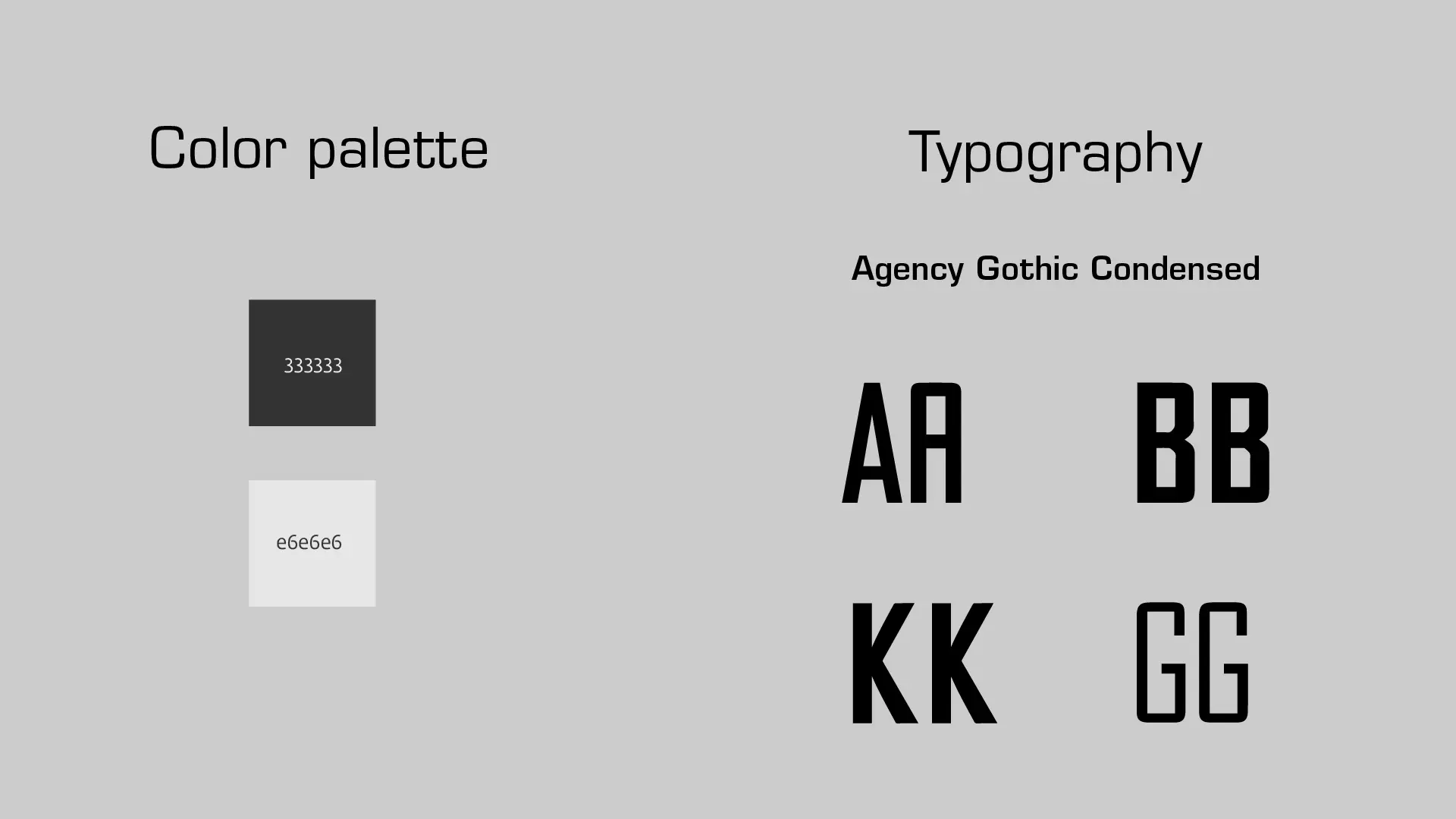
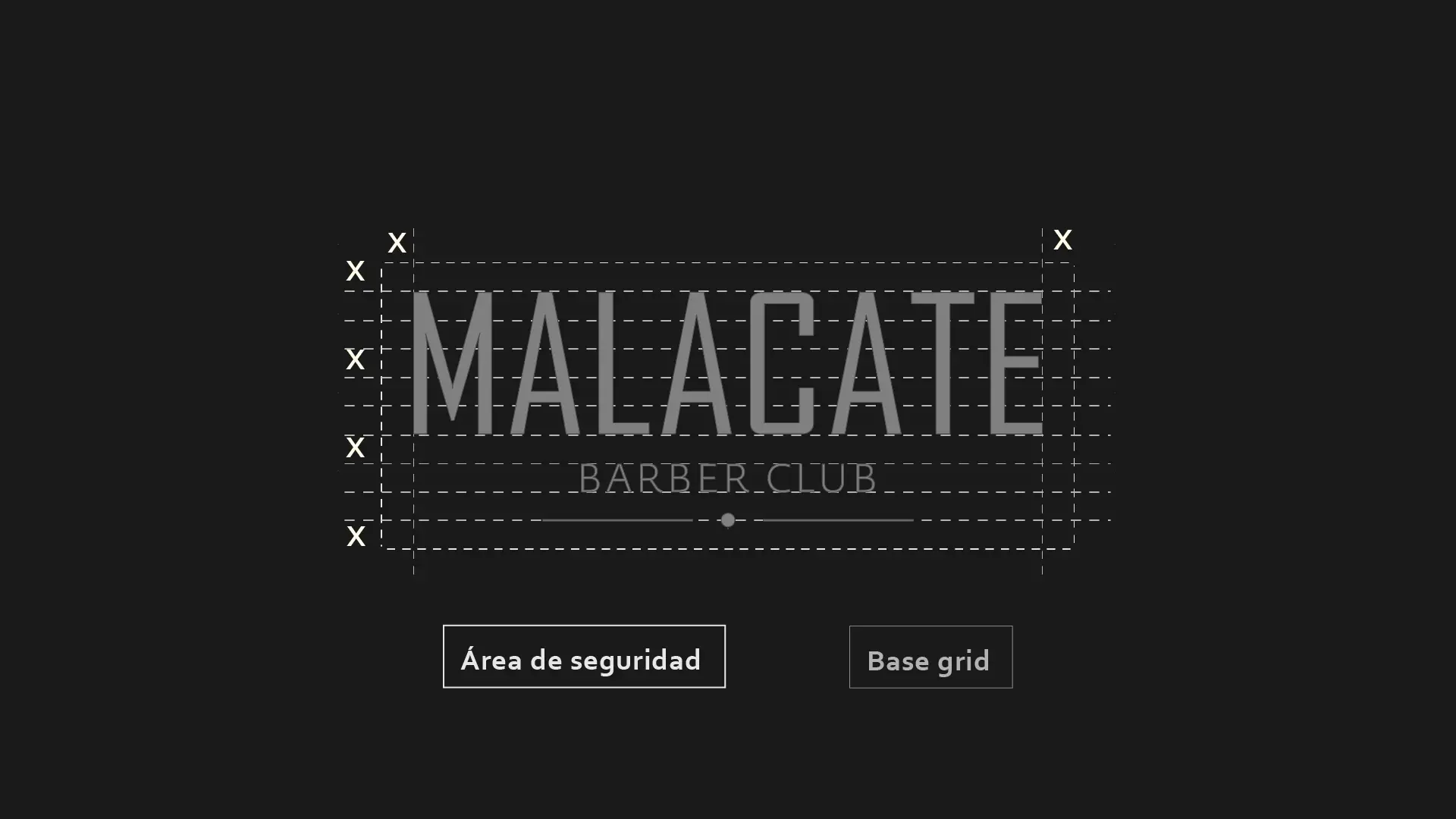
At the core of Malacate's visual identity is a purely typographic logo crafted with Agency Gothic Condensed typeface. This font is a testament to the barbershop's ethos, striking a unique balance between toughness and approachability.
The choice of Agency Gothic Condensed speaks volumes – its rectangular, condensed form conveys a sense of robustness and masculinity, with each character appearing as a block, side by side, reflecting the strong and unwavering traits often attributed to men.
Yet, the rounded edges of this font soften its overall demeanor, avoiding any harsh or distant connotations.
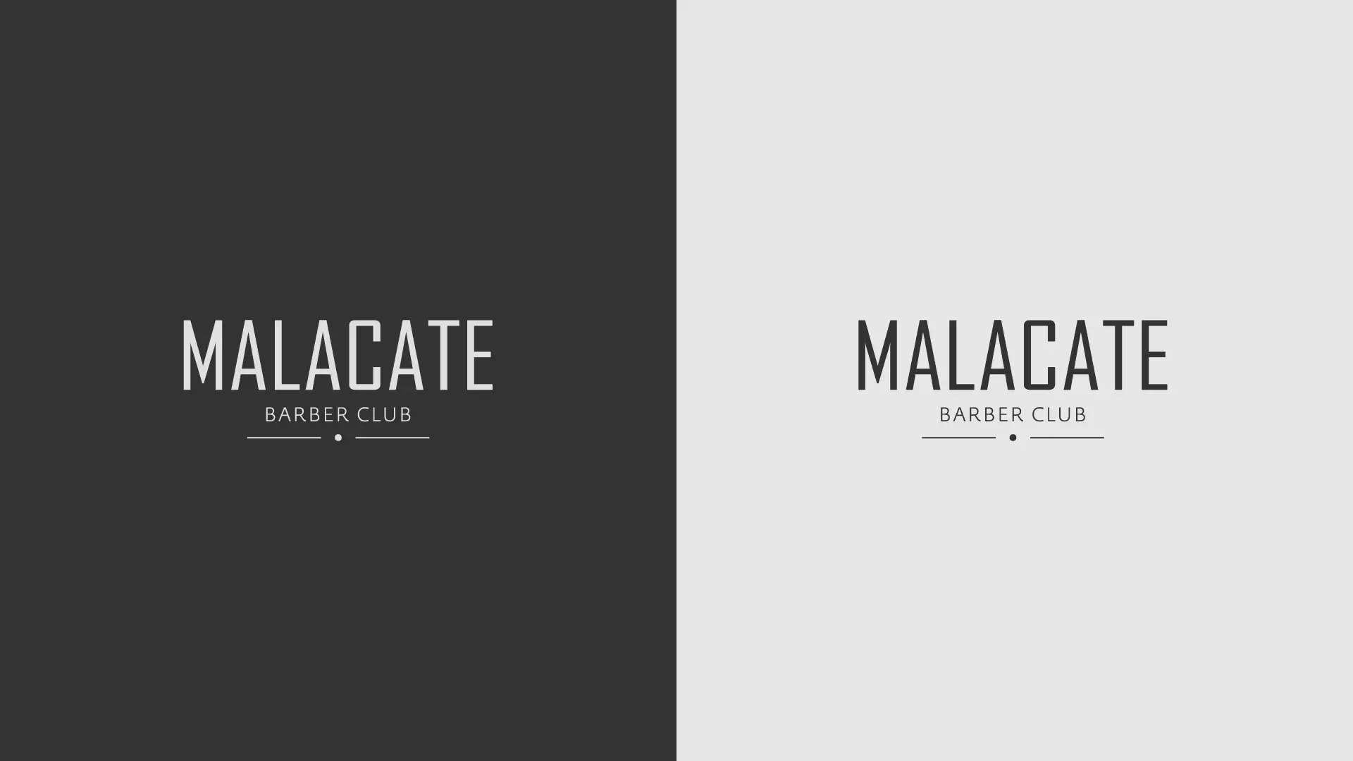
As for the color palette, the deep gray with a hexadecimal code of #333333, nearly black, exudes an air of sophistication, aligning perfectly with Malacate's brand persona.
