Introducing the branding design for 'TCS Animation Studio'
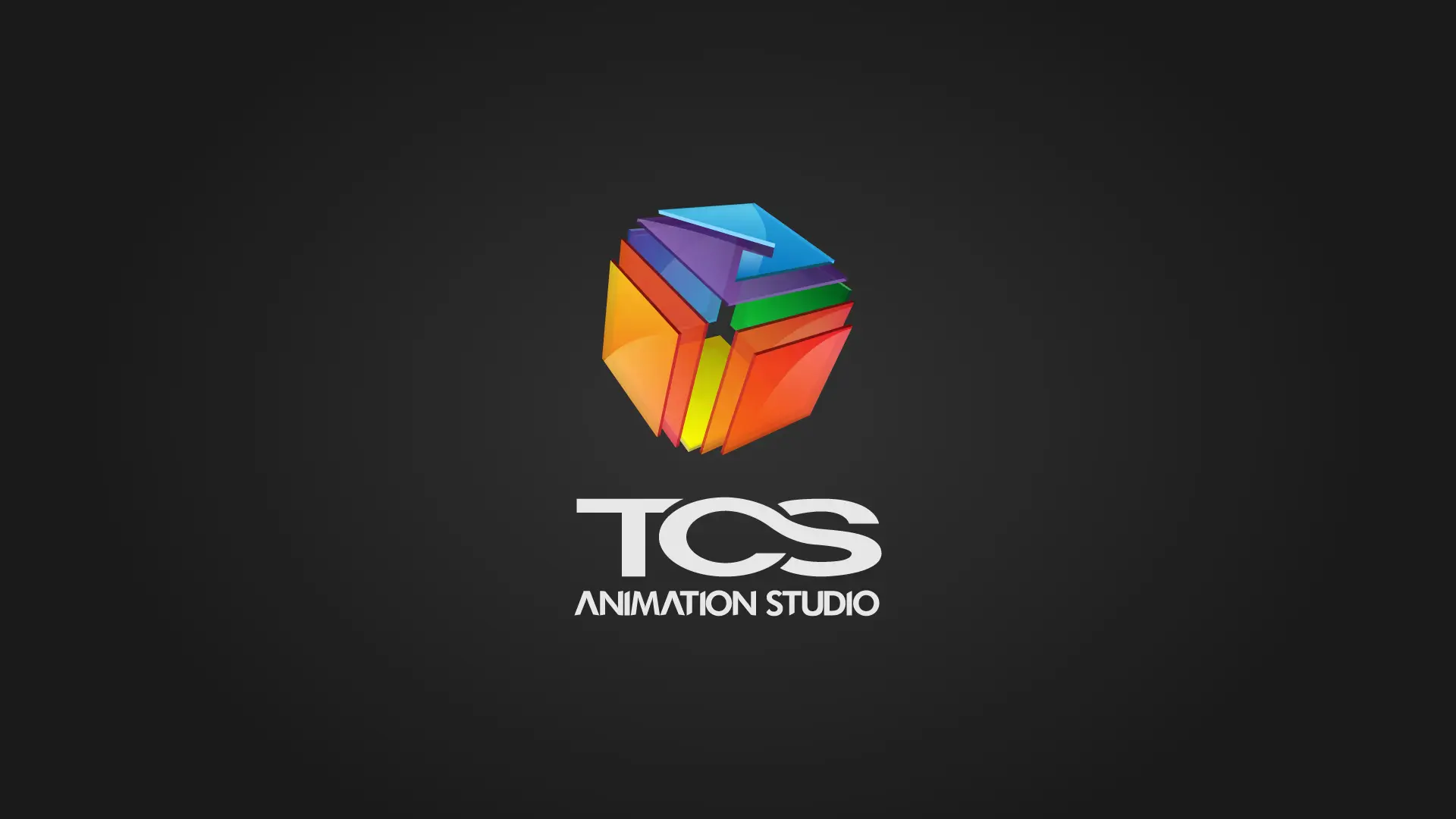
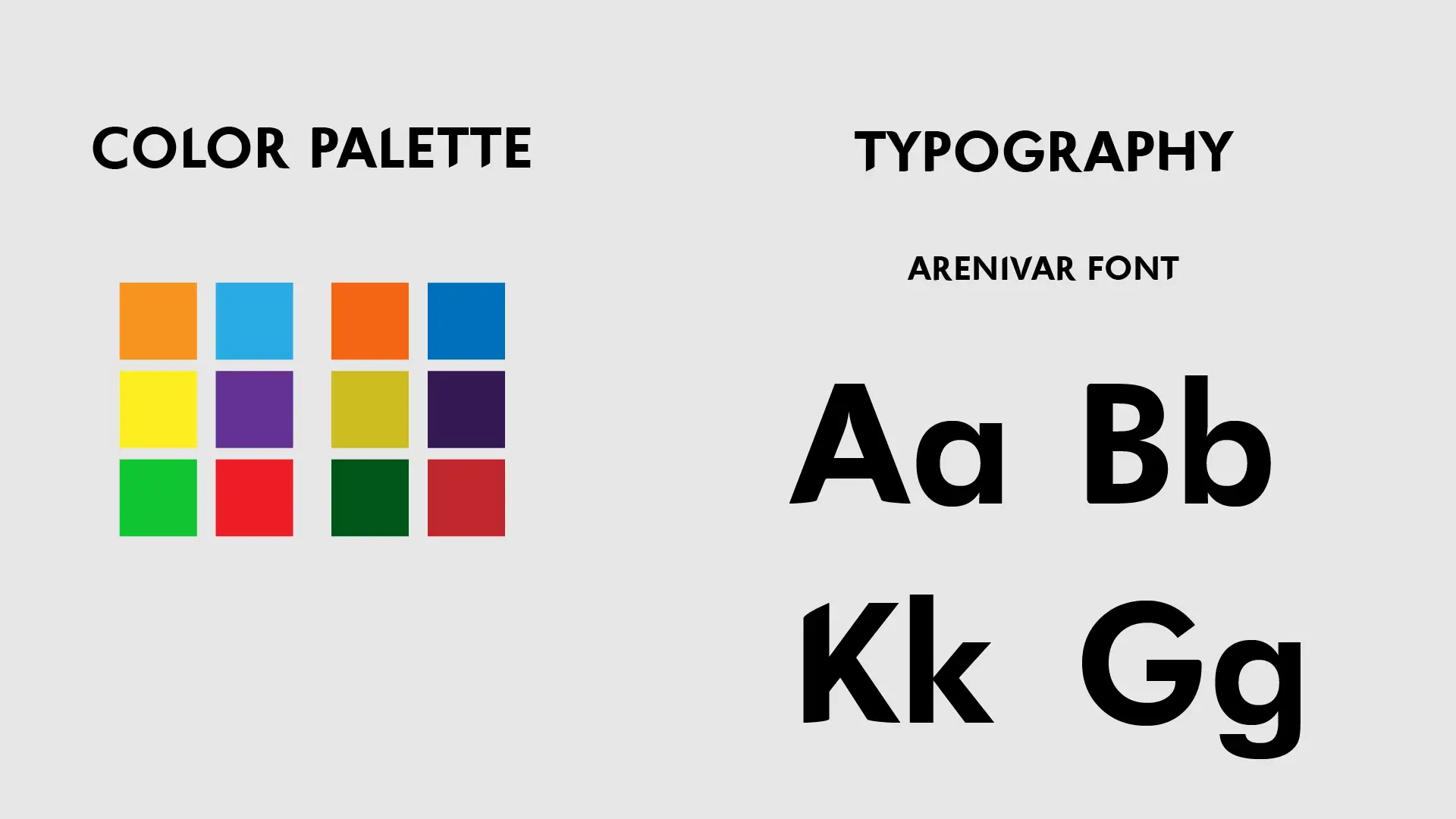
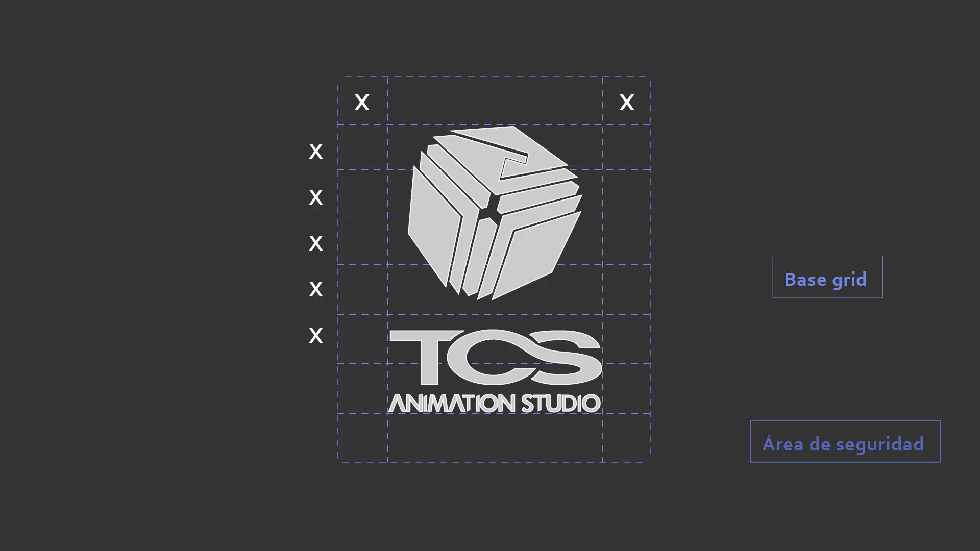
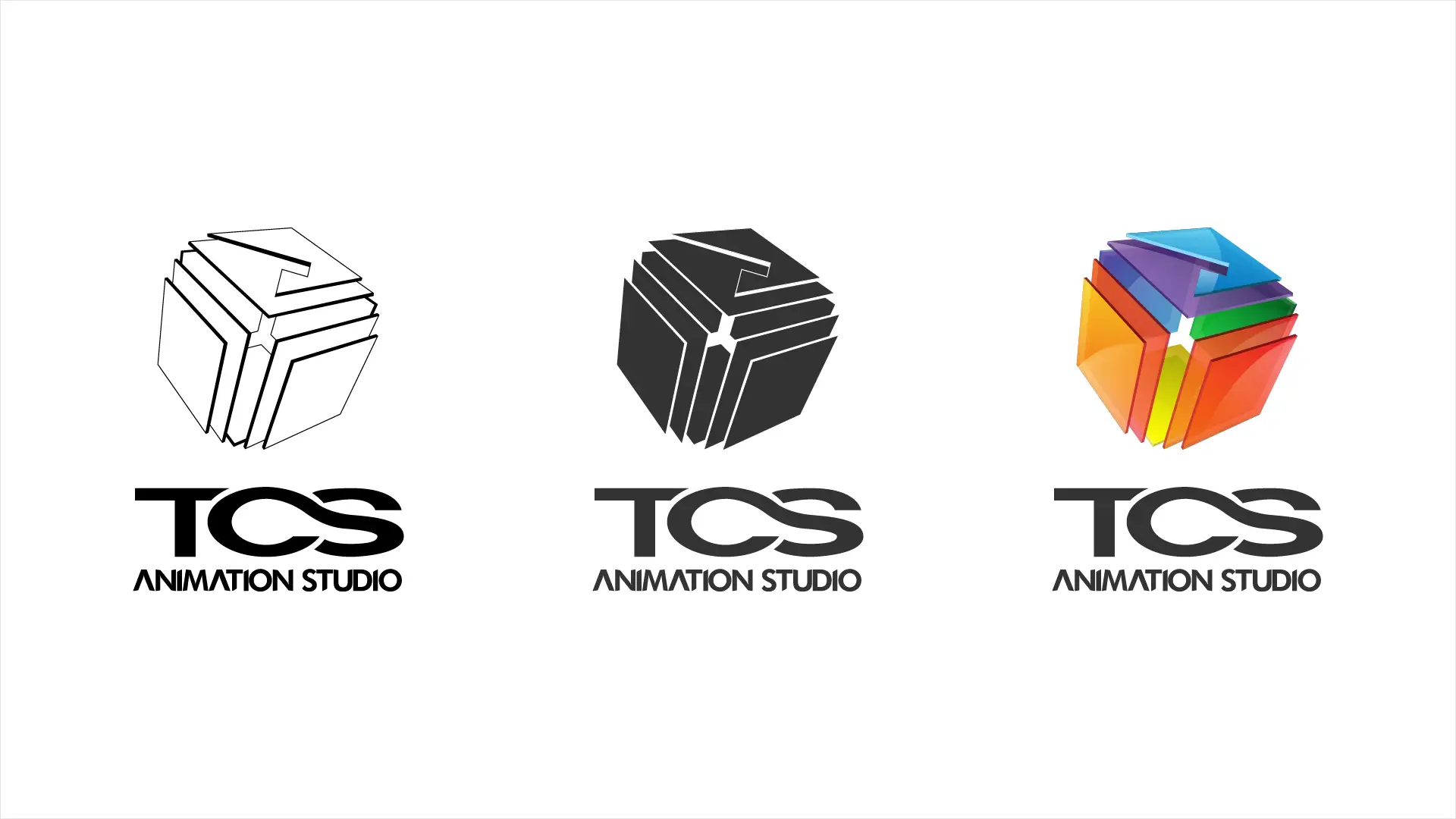
A prominent animation studio that melds dynamism with artistic nuance. This comprehensive portfolio showcases the logo design, underlying concept, mockups, color palette, and typographic choices. Through an in-depth semiotic analysis, we've crafted a brand identity that is both vibrant and meticulous, echoing the essence and passion of TCS ANIMATION STUDIO.
Concept
The subtle nod to the Rubik's Cube, a three-dimensional puzzle, underscores the complexity and meticulousness behind animation. Just as the Rubik's Cube demands skill and precision to be solved, the animation process calls for a keen eye and expert touch to seamlessly piece everything together, delivering an immersive visual experience.
Accompanying this striking design is the use of a bespoke typography crafted uniquely for this project: the "ARENIVAR FONT". Rooted in my own surname, this custom font injects a personal touch into the design, underscoring the exclusivity and precision put into every aspect of the branding.
The portrayal of a cube, with its distinct separated layers, mirrors the essence of animation: individual pieces that, when correctly assembled, spring to life to weave a full, cohesive narrative. Much like in the animation realm, each segment, essential in its own right, forms part of a grander whole. This paneled separation emphasizes the individuality of elements in an animated scene, highlighting the significance of each detail and its contribution to the overall masterpiece


